This article was written with AI assistance and reviewed for accuracy where possible; details about unreleased or rumored products may change.
We have all been there. You stand in front of your closet, staring at rows of shirts, pants, and dresses, feeling like you have absolutely nothing to wear—despite a closet full of clothes. Often, the issue isn’t the quantity of your items, but rather the hesitation to combine them in ways that feel cohesive and intentional. Mixing and matching colors is a superpower that can turn a collection of individual garments into a versatile, high-fashion wardrobe. Whether you are browsing for new denim, refreshing your baby’s essentials, or simply trying to style the pieces you already own, understanding color theory is the key to unlocking your personal style.
Understanding the Color Wheel: Your Ultimate Style Guide
Before you start experimenting with bold shades, it helps to return to the basics. The color wheel is not just for artists; it is the fundamental tool for any fashion enthusiast. At its core, the wheel is divided into primary, secondary, and tertiary colors. To mix colors like a pro, you need to understand how they relate to one another. Complementary colors, which sit directly opposite each other on the wheel, create the most striking, high-contrast looks. Think of a deep navy blue paired with a warm, burnt orange. These pairings are naturally pleasing to the eye because they balance each other out perfectly.
If you prefer a more subtle, sophisticated aesthetic, look for analogous colors. These are colors that sit side-by-side on the wheel, such as blues and greens or reds and oranges. Analogous combinations feel harmonious and gentle, making them perfect for everyday office wear or casual outings. By simply looking at the color wheel, you can move away from the safety of monochrome and start building outfits that feel vibrant and thoughtful.
The Power of Neutrals as Your Canvas
While color is exciting, neutrals are the glue that holds a wardrobe together. When we talk about neutrals, we are referring to black, white, gray, beige, navy, and cream. Many shoppers shy away from bright colors because they worry about looking like a walking rainbow, but the secret is in the ratio. If you want to incorporate a bold color, like a bright cobalt blue or a vivid fuchsia, ground it with a neutral base. A pair of classic, high-quality jeans in a dark wash can serve as the perfect anchor for a bright, patterned sweater or a colorful blouse.
Think of neutrals as your blank canvas. If you find yourself gravitating toward neutral tones in your daily shopping—whether it’s home decor, tech accessories, or casual streetwear—consider adding one “pop” color to your ensemble. It could be as small as a colorful pair of socks, a bright bag, or a statement belt. By keeping the bulk of your outfit neutral, you eliminate the risk of clashing while still showing off your personality through intentional color choices.
Mastering the Art of Color Blocking
Color blocking is the technique of wearing two or more solid colors together in large, distinct blocks. This trend has moved from the runway to the streets and remains one of the most effective ways to look put-together with minimal effort. To master this, avoid overcomplicating it. Start with two colors that occupy different spaces on the color wheel. For example, a crisp pair of trousers in a deep emerald green paired with a top in a soft, lilac purple creates an unexpected yet harmonious look that feels modern and chic.
When color blocking, pay attention to the intensity of the shades. If you are pairing a bright red with a bright yellow, keep the silhouettes of the garments relatively simple to ensure the colors do the talking. If the clothing has ruffles, textures, or complex patterns, the color blocking can quickly become overwhelming. Keep the cuts clean and the fabric quality high to ensure the look remains elevated rather than chaotic.
The 60-30-10 Rule for Balanced Styling
If you are intimidated by mixing more than two colors, lean on the 60-30-10 rule. This is a design principle often used in interior decorating, but it applies perfectly to fashion. Your primary color should make up about 60% of your outfit—usually your largest pieces like a dress, a coat, or a combination of pants and a shirt. Your secondary color should account for 30%, which could be a blazer, a cardigan, or a skirt. Finally, the remaining 10% is your accent color, reserved for smaller accessories like jewelry, scarves, shoes, or even the subtle details on a pair of sneakers.
This rule ensures that no single color competes for dominance, allowing the eye to travel across the outfit naturally. If you are shopping for a new season, try picking a palette of three colors that you love and ensuring every new item you buy fits into that scheme. This makes it infinitely easier to get dressed in the morning, as you know that almost everything in your closet will work with everything else.
Seasonal Shifts and Color Psychology
Our color choices often mirror the changing seasons, and for good reason. Understanding seasonal color psychology can help you feel more in sync with your environment. In the spring, we naturally gravitate toward pastels and light, airy tones that reflect growth and freshness. Summer invites bold, tropical hues that stand out against the bright sun. As autumn rolls around, deeper, warmer tones like rust, mustard, and forest green take center stage, while winter is the perfect time for icy blues, silver, charcoal, and, of course, the ever-elegant black.
However, do not feel restricted by the calendar. If you love wearing bright yellow in the middle of a gray January, do it! The most important aspect of style is how a color makes you feel. If a specific shade boosts your mood, it is a great addition to your wardrobe. Whether you are looking for soft, gentle tones for your baby’s clothing or looking to add some edge to your men’s or women’s collection, choose colors that reflect your current energy.
Texture and Pattern: The Hidden Variables
When you are mixing colors, remember that the texture of the fabric changes how that color appears. A bright red silk blouse will reflect light differently than a bright red wool sweater. Texture adds depth to your color pairings. Mixing a matte cotton with a shiny satin, or a heavy knit with a light linen, can make an otherwise simple color combination feel high-end. When you are putting together an outfit, consider how the “feel” of the fabrics interacts.
Patterns also play a significant role. If you want to mix colors but feel unsure, start by pulling one color from a patterned item and repeating it in a solid piece. For example, if you have a floral skirt with hints of navy, yellow, and white, pair it with a solid navy tank top. This ties the outfit together instantly and makes your pattern-mixing feel like a professional styling choice. It is a foolproof way to experiment with complexity without feeling like you have lost control of the look.
Monochromatic Sophistication
If the idea of mixing different colors still feels a bit daunting, start with a monochromatic look. This does not mean you have to wear the exact same shade from head to toe, though that is certainly an option. Instead, try wearing different tones of the same color. Pair a light cream sweater with a darker tan trouser and camel-colored shoes. The variation in shade adds depth, while the consistency of the color family ensures you look polished and intentional.
Monochromatic looks are incredibly flattering because they create a continuous line, which can make you appear taller and more streamlined. It is also the easiest way to look “expensive” on a budget. By focusing on textures—such as a ribbed knit paired with smooth leather—you can create a monochromatic outfit that is visually interesting without needing a single drop of contrasting color.
Final Thoughts: Confidence is Your Best Accessory
Ultimately, the rules of color are meant to be a guide, not a cage. The best outfits are the ones that make you feel confident and comfortable. If you find yourself in a style rut, try picking one item in your closet that you never wear because you “don’t know how to style it,” and challenge yourself to pair it with a color you wouldn’t normally choose. You might find a new favorite combination that surprises you.
Remember that experimentation is part of the fun of personal style. Whether you are browsing for the latest tech gadgets with a sleek, minimalist aesthetic, looking for durable kids‘ shoes that can handle any color of the playground, or hunting for the perfect fragrance to match your vibe, your choices reflect who you are. Don’t be afraid to break the rules, swap the accessories, and have fun with your wardrobe. After all, the best way to master color is to simply start playing with it.
As you build your collection, keep an eye out for versatile pieces that can bridge the gap between different color palettes. A great pair of denim, a classic blazer, or a well-chosen accessory can be the difference between a wardrobe that feels limited and one that feels limitless. Happy styling, and enjoy the process of turning your closet into a canvas.
The Role of Lighting in Color Perception
It is easy to forget that the colors you see on your screen while browsing online may shift once they arrive at your door and enter your home environment. Natural sunlight, fluorescent office lighting, and warm indoor bulbs all alter the way pigment is perceived. A color that looks vibrant and sharp under bright, cool-toned store lighting might appear muted or muddy in a dimly lit living room or a bedroom with soft, yellow-tinted lamps. When you are curating your collection, it is helpful to observe how your favorite pieces transition from day to night. If a garment looks perfect in natural light but loses its appeal under artificial bulbs, you may find that it works best as a daytime staple rather than an evening wear option.
Understanding these subtle shifts can prevent the frustration of feeling like a piece “doesn’t match” once you put it on. If you are shopping for items that need to be versatile, look for colors with higher saturation or clear undertones, as these tend to remain more stable across different lighting environments. By being mindful of your specific setting, you can choose items that reliably look the way you intended, whether you are stepping out for a morning errand or settling in for an evening event.
Curating a Color Palette for Long-Term Versatility
Instead of viewing every purchase as a standalone decision, consider adopting a seasonal color palette for your entire household or personal inventory. By limiting your color choices to a curated set of hues that all share a common undertone—such as earthy, muted tones or cool, jewel-inspired shades—you naturally ensure that everything you own has the potential to work together. This approach simplifies the decision-making process when you are shopping for new additions, as you can quickly determine if a new item will complement your existing rotation. A cohesive palette acts as a filter, helping you avoid impulsive purchases that may eventually sit unused because they don’t integrate well with the items you already love.
Developing this “signature palette” is a process of trial and error that rewards observation. Over time, you will likely notice that certain shades consistently make you feel more confident or fit your lifestyle better than others. As you continue to expand your collection on MINIDROP, allow your palette to evolve alongside your personal tastes. By prioritizing harmony over trends, you build a functional, enduring collection that feels uniquely yours and minimizes the “closet fatigue” that often stems from having too many disjointed choices.
The Impact of Undertones on Skin and Style
One often overlooked aspect of color harmony is the relationship between your clothing and your skin’s undertones. Even when two colors seem to sit perfectly together on the color wheel, they may feel “off” if they clash with your natural complexion. Generally, skin undertones are classified as either warm, cool, or neutral. If you have warm undertones—often characterized by golden, peachy, or yellow hues—you will likely find that earthy tones like olive green, terracotta, and warm ochre brighten your appearance. Conversely, those with cool undertones, which lean toward blue, pink, or red, often look most vibrant in jewel tones like royal blue, emerald, or crisp, icy whites.
Identifying your undertones doesn’t mean you have to discard colors that fall outside your “season,” but it does help you select the most flattering shades for items worn closest to your face, such as blouses, scarves, or hats. If you find a color you love that doesn’t quite suit your complexion, try moving it to the lower half of your outfit—like a skirt or a pair of trousers—or incorporating it through accessories. This allows you to experiment with a wider spectrum of colors while keeping your most flattering shades as the focal point near your face, ensuring that your style choices feel intentional and harmonious.
Organizing for Color-Coded Efficiency
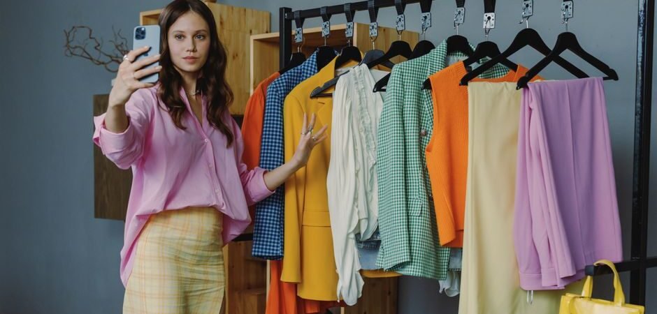
Once you have mastered the theory behind the mix, the physical act of getting dressed becomes much easier if your storage reflects your color strategy. Many people find that organizing their closet by color, rather than by garment type, provides a visual map of their wardrobe’s potential. By grouping all your blues, reds, neutrals, and greens together, you can instantly see where you might be lacking a bridge piece or where you have an abundance of one particular shade. This type of organization turns your closet into a personal boutique, making it easier to spot potential color-blocked combinations or monochromatic pairings that you might have otherwise missed when items were hidden at the back of a drawer.
When you group items by color, you are also able to identify the “holes” in your collection with greater clarity. If you notice a vast collection of navy and gray but very few accent colors, you can shop with purpose, looking for that one specific shade that will breathe new life into your existing pieces. Maintaining this level of visibility keeps your wardrobe dynamic; it discourages the “out of sight, out of mind” phenomenon and encourages you to rotate through your clothes more frequently, ensuring that every purchase earns its place in your daily rotation.